TV Streaming Add-Ons
laptop mobile
Marketing website
tv
TV Streaming
What did i do?
Add-On conversions up 19%
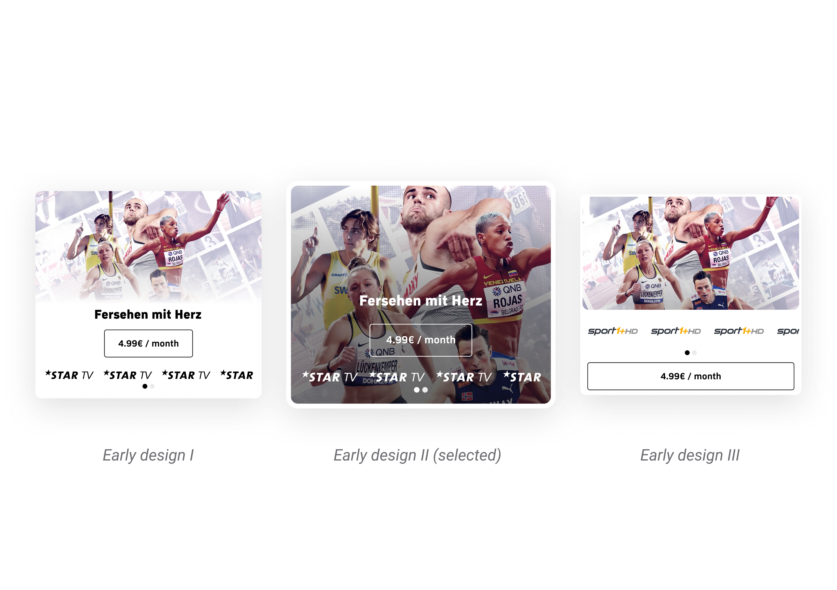
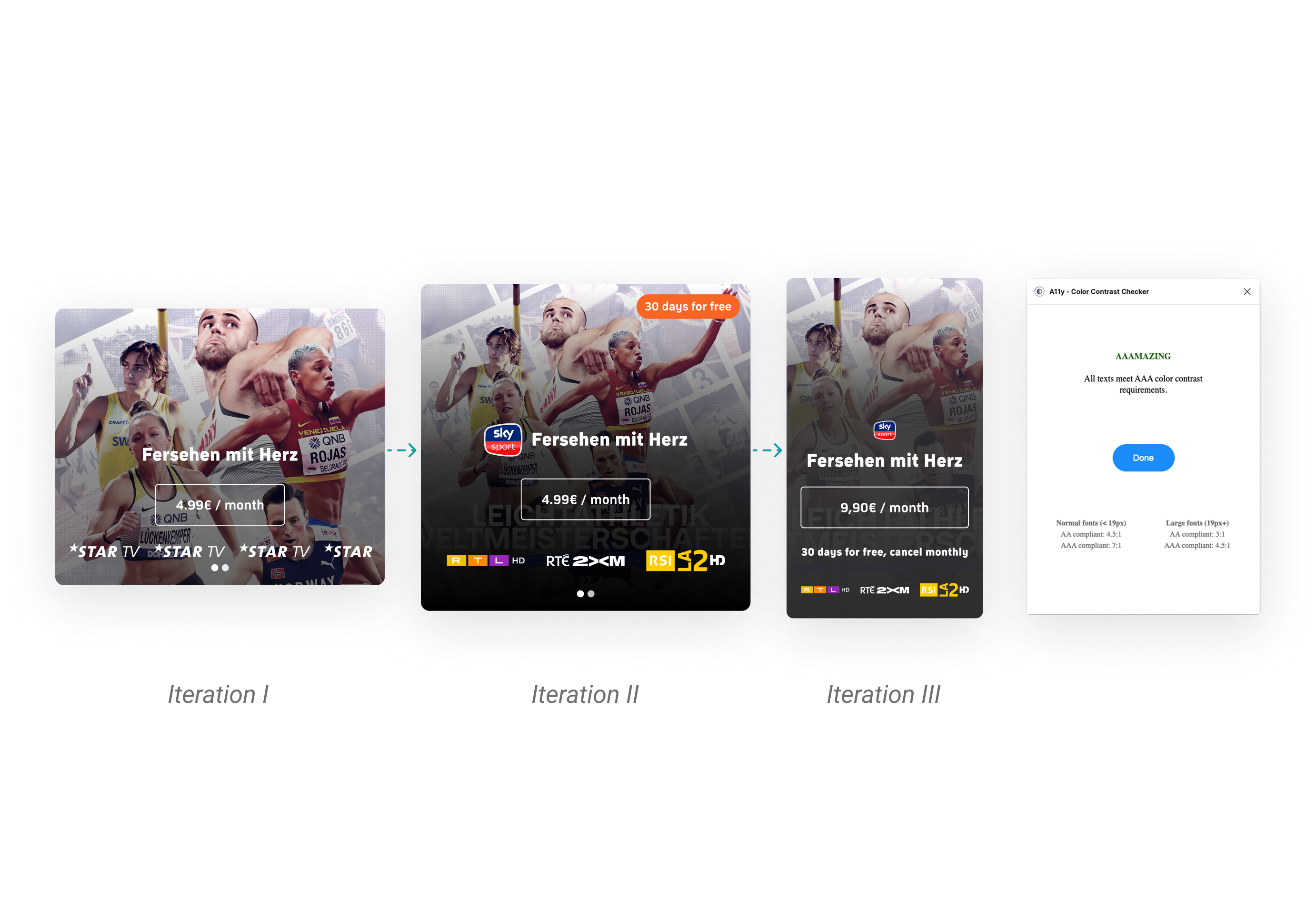
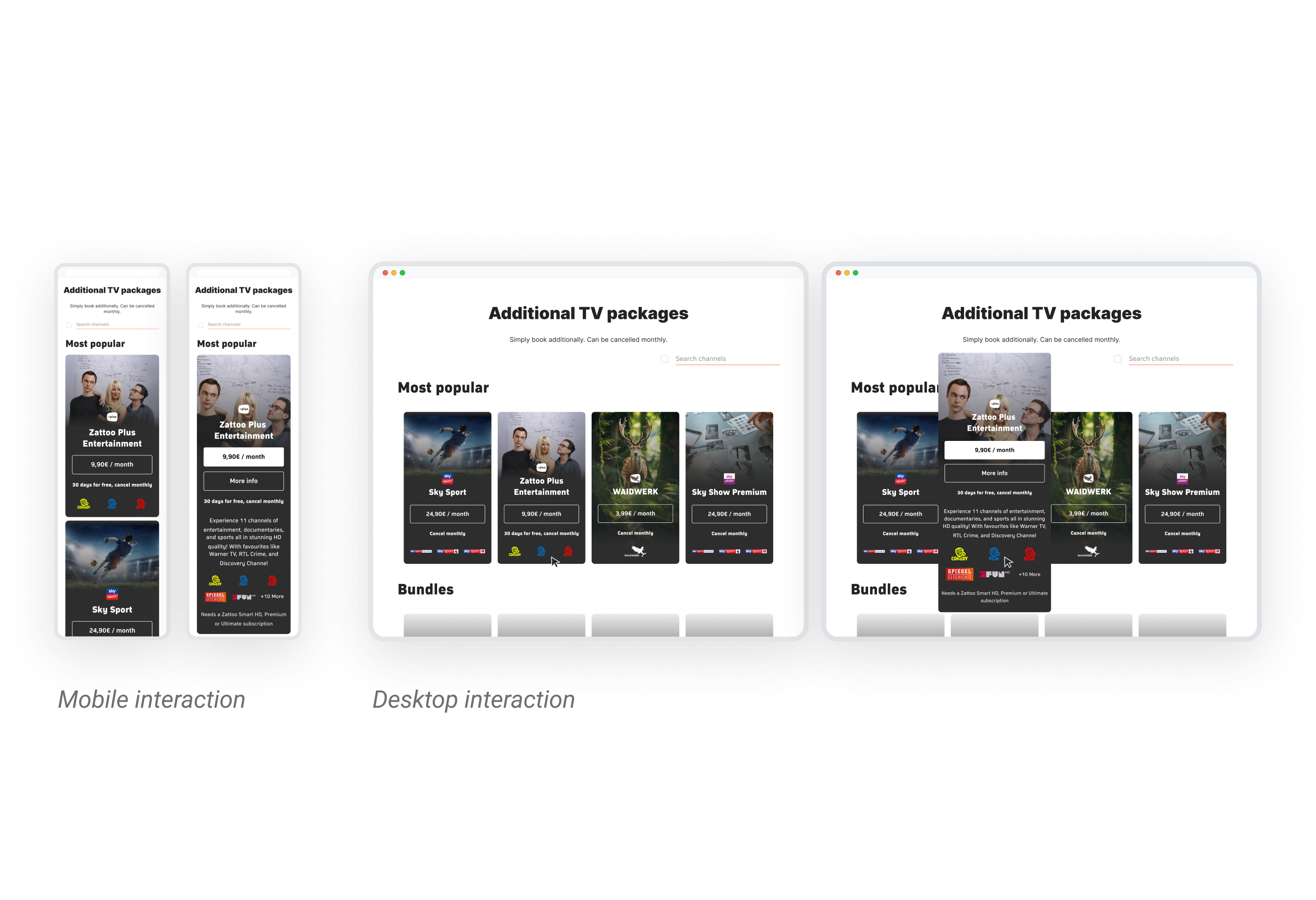
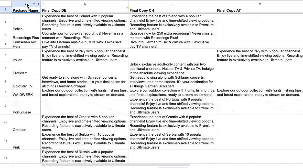
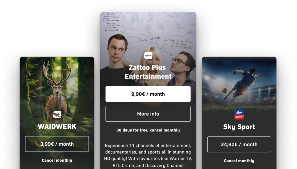
I owned the design, UX writing, and content design for Zattoo’s premium Add-On packages. By replacing logo-only cards with show-centric imagery and plain-spoken microcopy, I helped millions of viewers discover extra channels in seconds, lifting Add-On conversions by 19+ % and total subs by 4+ %.

What did i do?
Add-On conversions up 19%
I owned the design, UX writing, and content design for Zattoo’s premium Add-On packages. By replacing logo-only cards with show-centric imagery and plain-spoken microcopy, I helped millions of viewers discover extra channels in seconds, lifting Add-On conversions by 19+ % and total subs by 4+ %.